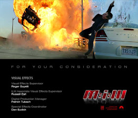
 You will undoubtedly hear this bit of advice repeatedly on this blog: the single best education for visual effects artists involves watching non-visual effects films and dissecting and analyzing the creative and technical choices made to achieve believable shots. In this article, I'll concentrate on organic, realistic camera work in live-action films and how photoreal visual effects artists can learn from cinematographers how to compose actors within the frame, and make their camera work feel natural and true to the style of the rest of the film. I'll also show you an example of my work from "Mission: Impossible III," and how I analyzed the film's camerawork to make my effects shot fit into the rest of the film.
One of the basic tenets of photographic camera work involves the framing of actors with appropriate headroom. Traditional Hollywood movies have used the rule of thirds to help guide cameramen into shooting pleasant compositions. Framing an actor's eyes to fit onto a line that is 1/3 of the way from the top edge of the frame is sure-fire way of achieving a 'proper' composition. Using this technique, the actors fill the frame in a pleasing manner with proper headroom; the audience can clearly read the actor's face. Generally speaking, this type of framing of actors' is the standard for Hollywood films. Unless a filmmaker has a stylistic reason for framing his actor differently (to give the shot a different, off-balance emotional feel), you will see this type of framing as the standard.
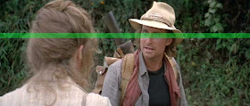 The same shot, with an upper-third overlay. Notice how Michael Douglas' eyes perfectly line up with the upper third of the frame.
Better yet, this kind of framing consistency means that when one shot cuts with another, the audience doesn't need to frantically scan the frame to lock their eyes on what is important: the actor's eyes. Actors' eyes are consistently featured at the upper third of the frame, which leaves the audience only to scan the frame horizontally from shot to shot. It's a subtle way to help guide an audience member through a sequence. Remember, in most cases, traditional Hollywood narrative films need to keep the techniques subordinate to the story. The editing, sound effects, cinematography and set design all need to service the story and characters, rather than call attention to themselves.
This lesson is extremely valuable to anyone who creates visual effects or animated shots from scratch. Without any live-action footage to use as a basis, it is up to the artist to frame the shot properly. In these cases, it is important for visual effects artists to mimic their live-action counterparts and understand this basic convention of cinematography.
Let's watch this scene from "A Fish Called Wanda," directed by Charles Crichton. Watch how effortlessly we cut from angle to angle in this brilliant sequence, completely devoid of dialogue.
fish from Todd Vaziri Vimeo on Vimeo.
Watch it again, this time with the sound down (as to not distract you from analyzing the visuals), and pay close attention to the compositions, particularly on Michael Palin's close ups. Notice how the camera operator consistently frames its subjects in a pleasing manner, consistently striving for pleasing compositions, not only for actors but props and set pieces (like a gun, a pulley, ropes, and a giant block of concrete).
Notice how the cameraman is constantly reframing his tilt angle to give Palin a pleasant composition within the frame. These shots were photographed with a human being behind the camera, with separate pan and tilt wheels being cranked to frame the shot properly. This lends the shot an organic, hand-created quality, something that is frequently missing from visual effects shots that are 100% synthetic.
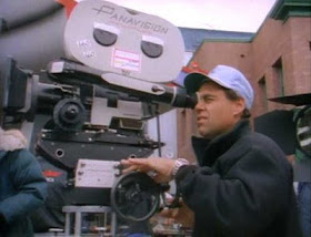 Raymond Stella, camera operator, sets up a shot for "Back To The Future Part II." Notice the pan wheel (on the left of the mount) and the tilt wheel (at the rear of the mount).
Why is there sometimes a discrepancy between the feel of real camera moves and synthetic moves? Why do purely synthetic visual effects shots sometimes stand out from ordinary non-effects shots? There are two primary reasons: purely synthetic camera compositions are not framed properly, and the camera's pan/tilt movement is frequently robotic.
As we just discussed, professional cinematographers have the tenets of composition in their DNA; on the other hand, very few digital artists have a photographic background, so it is important for these artists to have a solid foundation of knowledge when it comes to these concepts. Proper framing of subject is something any digital artist can learn.
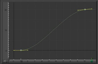 A more difficult and subtle technique to learn, however, is the skill of adding the organic pan and tilt adjustments to a shot. Rather than pan and tilt wheels being 'performed' in real time on a set, synthetic camera moves are programmed using motion curves on a computer. By default, these curves are exquisitely perfect with either linear perfection, or computer-created acceleration and deceleration slopes. And, if the artist doesn't go in and 'mess up' those curves, they will end up creating a camera move that is sterile and robotic.
Antiseptic, inorganic camera moves are not deal-breakers, but they subconsciously take the viewer out of the experience. A visual effects shot with crystal-clean camera movement, within the context of non-effects shots, is disruptive to the viewing experience. An audience becomes conditioned to the natural, organic nature of a film's camera movement, which makes the visual effects shot stick out, even if that visual effects shot looks completely photoreal and convincing. This is one of those situations in visual effects that, when noticed, causes audiences to say, "That shot feels fake. I don't know why it looks fake, but there's definitely something fake about it."
How can shots with robotic camera moves slip through the cracks? How can visual effects supervisors allow this kind of camera animation get through to the big screen, given all of the hard work and constant reviewing that the shot gets during production? The answer is simple - the vast majority of the time, a visual effects shot, while in production, is viewed hundreds of times on a loop, without any context. The shot just plays over and over at an artist's desk, in dailies and in client reviews. Yes, the shot is cut into a sequence (both on the effects house's side, and on the client's side), but the vast majority of the time, the shot is being analyzed and critiqued in a vacuum. And in a vacuum, the camera move might look just fine. In fact, having an overly-smooth camera move in an effects might actually increase the chances of a shot getting approved. Subconsciously, the artists want their work to be seen, and seen clearly (not only for reasons of vanity, but also from a story point of view), and keeping the camera moves uncomplicated certainly helps the readability of the shot. Adding organic tweaks and twitches to the camera move may be correct and more realistic in context, but it may actually decrease the readability of the shot. Personally, my artistic sensibility is to err on the side of naturalism over readability. Our job as visual effects artists is to make shots that feel as spontaneous and organic as possible, as if the action is truly happening right in front of our eyes; creating organic camera moves is part of that process.
Here's another section of the "Wanda" scene, played back in slow motion with an upper-third horizontal line overlay, so we can better analyze the camera movement.
Notice how the operator is striving to hit the proper eyeline framing. Look at all of the micro movements in the tilt that occur throughout the shot. The operator knows the key marks that Palin will hit, but he doesn't necessarily know precisely when he'll hit those marks. The result is the kind of organic, humanistic camera movement that subtly reminds you that this is a movie made by human beings. These are the kinds of cues that are important to add to synthetic camera moves.
Depending on the shot, the camera operator might miss a moment entirely. Watch this clip from the "Wanda" sequence to see what happens when the operator is a bit behind the action.
For a moment, Palin's eyes are completely off screen. Watching this shot on a loop, one might be surprised that a shot like this would actually make it into the movie. In fact, this is one of those "I would never be able to get away with that kind of move in visual effects" moments. No visual effects supervisor or director would approve an effects shot with that kind of camera move in their shot-- they would complain that the move is far too wild, and we lose focus on what's important: Palin's horrified reaction to what he has just done. However, within the context of the rest of the scene, we 'get it,' and Palin's eyes briefly leaving frame just adds to the emotional shock and absurd comedy of the scene.
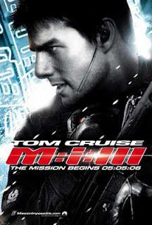 Of course, every cinematographer and camera operator has a different style. One cannot study the camera style of a single film and expect to understand the vocabulary of camera movements. "A Fish Called Wanda" was classically shot; in creating this character-driven comedy, the filmmakers made a conscious decision to allow the actors to move within the frame, shoot relatively static, and not call attention to the filmmaking process by keeping the camera moves unobtrusive. On the other hand, a modern action film like "Mission: Impossible III" contains a visual style quite different.
Director J.J. Abrams and cinematographer Dan Mindel created a film whose camera movement was essentially a character in the film. Rather than allowing the camerawork to be invisible and unobtrusive, the camerawork in "MI3" does some heavy lifting; the frenetic nature of the camera style adds to the chaos and unpredictability of the action sequences. Rather than letting the actors work within a static frame, the camera takes us along for the ride and interacts with the characters and the action. When Ethan Hunt (Tom Cruise) is running down the Chesapeake Bay bridge, the camera is running right along with him, trying to keep up, mirroring the emotions of the characters. This style is sometimes called cinema verite, or documentary-style filmmaking, where the camera is an active participant in the action, rather than objectively and coldly recording the choreography.
I was sequence supervisor of the visual effects for the bridge attack sequence for "MI3" at Industrial Light & Magic. To ensure that our visual effects shots fit seamlessly into the rest of the film, we had to pay close attention to the style of camerawork created by Mindel and camera operator Colin Anderson. Here is a portion of the bridge attack sequence, which is entirely comprised of first unit camera work. (Although there are a few ILM shots in this clip, we didn't alter the camerawork in any way.)
Notice the style of camera movement in the clip, contrasted with the "Wanda" clip. The "MI3" camera is constantly pulsing and breathing, mimicking Hunt's point of view. It's a moment of chaos, and the characters are trying to react to this chaos, and so is the camera. In this clip, the camera is constantly searching, readjusting, sometimes losing 'proper' framing. There are a couple of micro-crash zooms in the clip, as well, which is something one would typically see in a documentary. This is exactly the sequence I studied to help create the camera move for one of our big effects shots of the sequence-- a shot that I composited, and that would require a synthetic camera move.
The final two shots of the above clip were very important to me, since they had a very similar tone and feel to my shot, with similar action and camera choreography. The style in which Mindel and Anderson photographed those two shots would be my inspiration for the camera move for "be064," the production code for the shot of Hunt getting blown forward by the shockwave of the truck explosion behind him.
Because of the staggering complexity of the stuntwork, special effects, and ultimately the visual effects work, the base background plates were photographed as smoothly as possible, rather than 'performed' as the rest of the movie was photographed. Visual effects supervisor Roger Guyett needed to make sure that we captured pristine photography of the elaborate stunt that the actor, himself, would be performing, along with the amazing practical special effects explosion.
Here are the base photographic plates for the shot, as featured in the "MI3" 2-disc DVD special edition:
As you can plainly see, the base photographic plates for be064 were shot without panning or tilting, slightly wider than necessary, and captured with two cameras with spherical lenses (I would later merge these plates into one large, wide anamorphic plate). I also built my composite with this smooth camera move, without any frenetic camera moves. Once my smooth pre-composite was in good shape, I would add the camera moves in the 2D composite.
Abrams had some very specific camera direction for key moments in the shot. At the head of the shot, he wanted to be tight on Hunt (similar to the framing of the second to last shot of the first "MI3" clip.) Then, just before the missile hits the truck, he wanted a crash zoom out, to reveal a wider view of the action. Then, after the explosion occurs, he wanted the 'operator' to pan/tilt and zoom into the unmanned aerial vehicle (UAV) that whizzes right over Hunt's head. After the flyby, Abrams wanted me to bring the camera back to our hero, still reeling from the shock of the explosion.
Needless to say, that's a lot of choreography for a pretty short shot. To add to the complexity, I would need to add an explosive camera shake to the shot (in reaction to the massive explosion behind Hunt).
Here is the shot as it appeared in the film:
Here were my specific ideas for the camera moves for the shot:
• I was simulating the look of a handheld camera operator sitting atop a dolly, which gives us the smooth movement backwards with all of the energy of handheld.
• Because of the handheld nature of the shot, I made sure to maintain generally 'proper' framing, but also keep it active and chaotic, and allow Hunt's head to break frame from time to time.
• At the head of the shot, when we're still zoomed in tight on Hunt, I made sure to make the camera bobble realistically amplified, which is what you would see in a real-life camera shake with a long lens. Because the field of view is so tiny, even small camera bumps are seen as giant waves of movement. Of course, after the crash zoom out, I made sure to diminish the intensity of the camera bumps.
• On the crash zoom out, I made sure that the zoom and the pan/tilt readjustments that I would make post-zoom were not simultaneous. In real life, the operator zooms out, and then needs to make a split-second decision on framing. It's subtle, but it's there.
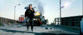
• On the explosive camera shake, I had to juggle two challenges which were at odds with one another. I had to make sure that the camera shake did not distort the image to a degree that we would somehow miss the important point of the shot - that the actor is doing his own stunt. This was a very important emotional beat to the shot; I didn't want the audience to think that I was tricking them, or hiding something with an over-the-top camera shake (which audiences, sadly, see all the time). I also had to make sure that the shake was appropriate for a giant explosion that was strong enough to blow an actor off of his feet, smashing into a parked car with such velocity that it shatters its rear window. If anything, I erred on the side of preserving the readability of the shot. Besides, all of the other effects I added (the dust shockwave, manually animating the briefcase across the ground, etc.) helped sell the intensity of the explosion.
• After Hunt hits the car, I wanted to tilt down with his body to achieve a better composition, but notice how I am just a bit late on the tilt. Keeping the tilt just a beat late gives the shot a bit of authenticity, as if the cameraman was operating the camera live, and didn't know exactly where his body would be at any particular time.
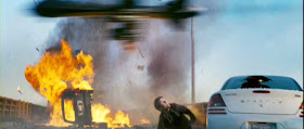 • On the UAV flyby, I tried to mimic a camera operator who could see the UAV out of the corner of his eye, and just barely was able to frame for the fast moving jet. And, if you look carefully, we never really get a good composition of the UAV at all, which was fine with us, since the UAV's flyby was an accent to the shot, not the main driving force of the shot.
• Finally, on the pan/tilt back to Hunt and the burning truck, I wanted to impart the energy of a camera operator who carefully rests the camera on his original framing, doing a bit of work to get the proper framing.
Ultimately, the biggest challenge for me was animating a camera shake for the explosion that was big enough to logically fit with the action (a human being blown off his feet), and yet not obscure the action and the big selling point of the shot, which is that Tom Cruise performed his own stunt. Abrams wanted the audience to truly feel what Agent Hunt was going through, to see the anguish on his face, and see what happens to his body after this amazing event.
Integral to this whole process was creating an organic, naturalistic camera move that complemented the rest of the film, and helped sell the spontaneity and reality of the situation.


Wow, that's a lot of thought process into such a camera move. However, watching the clip, it seems effortless, which I suppose is the point.
ReplyDeleteVirtual camera moves has always been a bit of a weakness for me, but I hope to practice some more, and take to heart what I've learned here.
Great read, I just love this level of detail and thought that goes into shot design, and such a treat to get to hear those insights. This is the sort of visual aesthetic that appeals to me, and your a great exponent of it Todd.
ReplyDeleteWith the current seeming backlash against cg images on film, it's this attention to naturalism that will prevail I feel. It's also just a stronger type of image than the floaty vitual shot.
It is forbidden for you to leave ILM Todd !!!
Great article, but I must confess I always had problems with the shot, ever since I saw it in the trailer. I mean, how can an explosion behind someone launch him to the left?
ReplyDeleteRule of thirds.... i can understand how it works horizontally, that seems obvious and natural, but what about vertically? Do the rule of thirds apply vertically? How would that work?
ReplyDeleteHoly shit. This was a fantastic, informative entry including two of my favorite movies. Thanks and great work on MI:3!
ReplyDeleteAnonymous wrote:
ReplyDeleteWith the current seeming backlash against cg images on film, it's this attention to naturalism that will prevail I feel. It's also just a stronger type of image than the floaty virtual shot.
For my tastes, I'm with you. I personally prefer action films with an organic, naturalistic aesthetic shot with an eye toward plausibility rather than ridiculously over-the-top camera styles ("Spider-Man" and "Van Helsing" quickly come to mind). Filmmakers who create live-action films with ridiculously elaborate camera-of-god shots, I believe, are shooting themselves in the foot; they're testing the audience's patience and suspension of disbelief.
ArchCarrier wrote: Great article, but I must confess I always had problems with the shot, ever since I saw it in the trailer. I mean, how can an explosion behind someone launch him to the left?
ReplyDeleteYou know, that was my first question to Roger when I was turned over the shot. When they arrived on the set to actually photograph the stuntwork, a certain amount of improvisation occurred - JJ, Cruise, and stunt coordinator Vic Armstrong adapted to the physical realities of the set, rather than adhering strictly to the previsualization (which had Hunt flying prominently forward). Certain realities existed--the original placement of the flipped-over truck, the ultimate destruction of the bridge, and the amount of airborne space required for Cruise to fly through the air and safely hit the parked car. Add to this, the complex nature of the stereo camera rig, the not-trivial explosion of the truck, the dolly backwards, and the synchronization of multiple passes, and you've got some serious hurdles. Are these excuses? Perhaps. But with all of these challenges, I think we succeeded in 'telling the story' with the shot, even though, in screen space, the explosion happens between Hunt and the car... and yet Hunt is thrown screen right. In context, I think it works pretty darn well.
Here's how I'll finish my thought: about a week before I finalled the shot, I did a quick test for Roger, where I actually grabbed Cruise's element (which we fully roto'd), and shifted him further screen right, to try and at least settle the screen space issue, and help out the physics of the shot (so the explosion would be the furthest left, then Hunt, then the car, which makes his shockwave trajectory more plausible). And because I couldn't move the car or the truck, I moved Tom. I slid him over about three feet, and also had to do some tricky retiming so all of the choreography beats still worked. Unfortunately, it only sorta-worked. Yes, his trajectory was more plausible, but it broke a few things. Firstly, and most importantly, Cruise's performance was being manipulated and retimed, which took away a lot of the organic, realistic grit of the stunt. Secondly, it was harder to read the missile hitting the truck (since Cruise was covering that area of the frame). Thirdly, the shot was unbalanced, with just about everything in the frame on screen right, with screen left almost empty-- it felt odd. So I restored all of the original placements, and that's how we finished the scene. It was worth a shot, but it just took away too much of the authenticity of the moment.
In terms of Cruise being pushed sideways (rather than forwards) by the missile explosion, I wonder also whether that was to differentiate it from the shot in the first MI film of Cruise being shot forward in the train tunnel with the helicopter exploding behind him?
ReplyDeleteOr maybe not.
tacky said...
ReplyDeleteRule of thirds.... i can understand how it works horizontally, that seems obvious and natural, but what about vertically? Do the rule of thirds apply vertically? How would that work?
Yes! The rule of thirds also has a vertical component as well, which also relates to how the frame is pleasantly weighted and composed. It will be the subject of an upcoming article.
Great article Todd! You always tie vfx back to it's context, film making. Ever think about writing a book? :)
ReplyDeleteI have to agree with ArchCarrier though, the physical dynamic of this shot never worked for me either. It's unfortunate as it is so well done otherwise.
Ian said... In terms of Cruise being pushed sideways (rather than forwards) by the missile explosion, I wonder also whether that was to differentiate it from the shot in the first MI film of Cruise being shot forward in the train tunnel with the helicopter exploding behind him?
ReplyDeleteYou know, I don't think that shot from the first MI even entered anyone's mind. (Only after I finalled the shot did I realize there was a thematic similarity.)
This is such a great, really rich read. Stumbled on your blog while looking for information on realistic "hand-held" camera moves in After Effects.
ReplyDeleteFirefly, BSG ... really wonderful how they make the vfx a natural extension of the camera work ... just as you have described here.
If you ever have time to delve into the mechanics of a crash zoom, that would be fantastic. The movement and blur is so subtle it is difficult to tell when and in what manner a "real" camera blurs on that moment of spinning the zoom ring.
Many thanks for the excellent work.