 One thing I tell young visual effects artists, particularly compositors, is "watch a lot of movies." When creating photorealistic effects for live-action feature films, the artists' paramount concern is to build up the plausibility of an unreal event; to create reality from synthetic. Understanding the complex way in which light is captured by lenses and recorded onto film is the foundation of this skill.
But what does "watch a lot of movies" really mean? Well, I firmly believe you can develop a strong photographic vocabulary, particularly revolving around creating photoreal composites, by looking at movies by decoding and deconstructing how they look. And not just any movie-- non-visual effects movies. Take particular notice of how these in-camera, non-effects shots appear; their characteristics, their aberrations, the way light dances through the lens to give us a recorded image, how camera movement affects the image, how different colors and intensities affect the image, just to name a few ways.
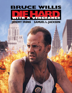
This is a long way of introducing a little viewing exercise from John McTiernan's "Die Hard With A Vengeance" (1995). There are, in fact, plenty of visual effects in "Die Hard 3," supervised by the deepest-voiced vfx supe in the business, John Sullivan. But the shot that we'll be examining is not an effects shot. It's a good, ole-fashioned, carefully choreographed camera move with multiple cues for actors and stunts. It also has the important duty of showing the audience the antagonist of the film for the first time.
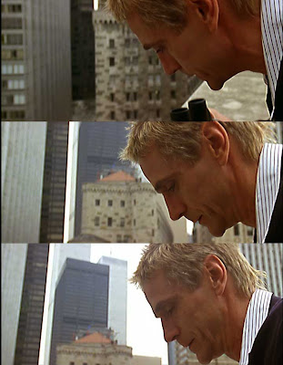
Look at all the beautiful things that are happening in this real, non-visual effects shot, and pay close attention to the three frames that are labeled "snap" at the top of the screen.
First, let's look at the context of this shot. We've just gone through a series of tight closeups on police officers planning a strategy to deal with a terrorist attack. Then we cut to our shot-- a wide, birds-eye-view shot looking straight down on the cops, scattering into action. The camera dollies across the edge of the building, revealing that our villain, Simon Gruber (Jeremy Irons) has been watching them all along through binoculars. Thematically, this view matches the villain's perspective; the cops are ants crawling around New York, playing a part in his master plan, almost like a gamer looking down at a board game. The camera tilts up to reveal Irons' profile, and his line "They bought it." He turns his head to an offscreen henchman: "You can begin."
The choreography of this shot is deceptively simple - but if you take a look, it is extremely complicated and required a good deal of rehearsal timing (there is virtually no dead time between the start of the tilt off the cops, revealing Irons' binoculars) and careful cues.
Now, here's where the effects artists really need to pay attention. Watch Irons' face carefully through the camera move, where the camera tilts up to follow Irons rising from a crouched position, particularly on the "snap" frames.
 Check out the values on Irons' face. It goes through a subtle change. Notice how his face seems to brighten throughout the shot. Is he moving into a light? No-- although there may have been some bounce cards and fill lights set up on that rooftop, he is not rising into a pool of light. Is the operator opening the aperture on the camera, letting more light through the lens? No-- that's not happening either.
Now, take a look at the space that is behind Irons, relative to screen space. At the head of the shot, the lens is completely filled with buildings in the background. Near the end of the shot, a significant part of the frame is filled with sky - an overexposed sky that has light values far beyond anything in the frame. The sky is so overpowering, it is polluting other parts of the image that is being captured by the lens. In effect, the sky is flaring out and flashing darker, foreground elements within the frame.
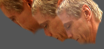
I've isolated Irons' face on those three "snap" frames, and placed them side by side against a gray card, so you can clearly see the progression.
 And this flashing isn't merely a depth issue. Take a peek at the midground building-- the dark strip of skyscraper on the left side of the frame. It also gets flashed and more exposed as the tilt occurs. This is a screen space phenomenon, not necessarily a depth-based phenomenon.
What does all this mean to a visual effects artist? We are frequently asked to put together bluescreen foreground actors against virtual or photographically-based backgrounds. Think of all of the thousands of visual effects shots comprising of an actor photographed against a bluescreen, composited over a realistic background.
Pulling a bluescreen is not rocket science. Compositing the pulled bluescreen over a provided background isn't brain surgery. The tools to perform these tasks are robust and ubiquitous. However, there is no shader, rendering engine, nor compositing program that will automatically perform these kinds of real, photographic phenomenon, as far as I know. The software does not know how to simulate this kind of organic, analog phenomenon. And, frankly, I think this is a good thing. Any such tool would take away flexibility from the artist. This is not a technological issue - it's an artists' issue.
 When compositing an element over a background that has heavily overexposed, make sure to slightly overexpose the foreground a little bit, or flash the foreground a bit. Technically, the cause of the foreground overexposure is a lens flare, but it is so large, soft, and without character and detail, there is really no need to build a digital lens flare. And the phenomenon does not occur solely over the edges of the foreground element; this is an effect that affects the image from top to bottom, or as large (in screen space) as the overexposed background.
In an upcoming article, I'll go over some techniques to simulate this phenomenon in two popular compositing applications, Adobe After Effects and Apple Shake. In the meantime, watch movies in a different way, trying to deconstruct what is actually happening on the screen, with the key intent on reconstructing these phenomenon in your effects shots.

4 comments:
Nice tip Todd. While watching the movie "Elephant" today, noticed a similar effect in reverse where the camera is following the character into the school. At the beginning there was more of the blue sky in the bg and the school building looks lighter and as we move in closer with less sky in the frame, the school building visibly got darker.
Great article and looking forward to the next!
Yes, loved the article as well...please keep them coming!
Although I am not in the movie business (I'm a children's book illustrator) I absolutely love your analysis of the art of digtal effects and moviemaking.
Keep the posts coming!
Hi Todd, that's nice what wrote here.
I love film and visual effects and this article is giving to me more in deep about what I like to do. looking forward to see more from you.
p.s. I'm doing something similar as effects on a shot. well, trying and doing few test.
Post a Comment