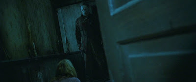
For "Halloween," Director Rob Zombie and cinematographer Phil Parmet created eerie senses of claustrophobia and unease by regularly framing extreme foreground elements, typically out of focus, to drive home this visual theme. Pushing depth of field to extremes and using the entire 2.35 frame for their compositions, Zombie and Parmet created the most anamorphic-y non-anamorphic film of recent memory.


In our next post, we'll look at another distinctive and innovative framing technique from "Halloween." Click here for Part 3.

2 comments:
People always give me the stink eye when I tell them Rob Zombie is an amazing director, but this film is beautiful.
Tell those stink-eye-having-folks to go to read these "Halloween" posts, and then force them to apologize to you. :)
Post a Comment