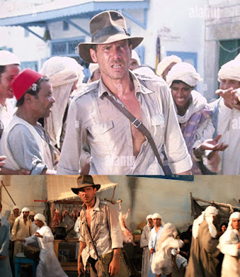
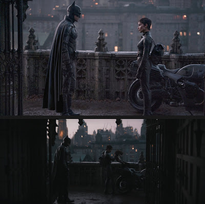
Criticize a finished movie all you want but please don’t make pretend “before and after” split screen images to stoke anger about color timing. The discourse is bad enough as it is.
The top image is a production still taken with a still camera and processed and color corrected for the express purpose of looking good as a production still (to be used online, magazines and newspapers). The bottom image is an altered frame from the trailer(?), which typically has different color timing choices than the final film. Of course, the original poster doesn't care about any of this.
It's very easy to make fake before/after images. See?
Also, please define "before" to me, either with film acquisition or digital acquisition. (There is no "before". There's only "the image as it has been handed to me by the previous step in the image pipeline".)
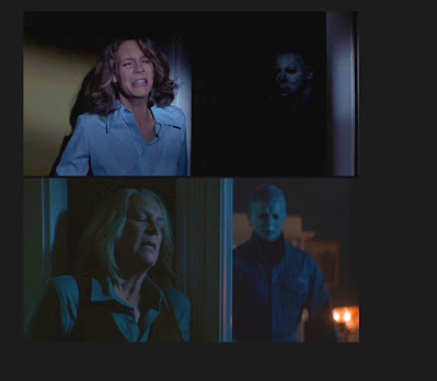
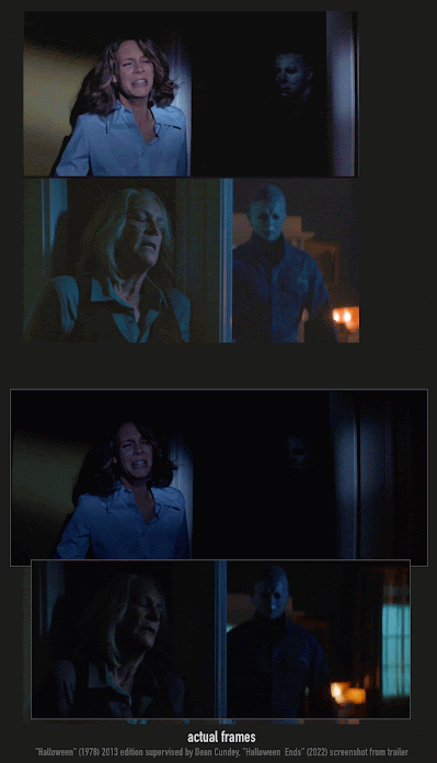
A while back someone tried to do a "gotcha!" tweet comparing the original "Halloween" (1978) and a grab from the trailer of "Halloween Ends" (2022). The original tweet is no longer online because the author has protected their tweets. This was their "comparison image", complaining how ugly the new movie looks:
[screenshot from 30-year old masterpiece, one of the most beautiful movies ever filmed]
[screenshot from random modern shitty movie gamma’d up]
look how fuckin ugly movies are today
But it wasn't even a fair comparison, since their "Halloween" screengrab was artificially brightened, and the screengrab from the "Ends" trailer" was decontrasted and brightened falsely.
original "Ant-Man 3" tweet: https://twitter.com/tvaziri/status/1627164184583766018
original "Halloween Ends" tweet: https://twitter.com/tvaziri/status/1579566528751886336


No comments:
Post a Comment