Saturday, June 28, 2008

"Ratatouille" and Visually Connecting Sequences

Movies aren't just a collection of scenes. Just as a song needs to gracefully transition from verse to chorus, a traditional Hollywood film needs to gracefully move from scene to scene. Unless it is the filmmakers' intention to create a jarring, disorienting cut from one sequence to the next (perhaps, mirroring a character's confusion within a story, like Leonard's journey in "Memento"), an audience is more likely to enjoy the ride if these transitions feel seamless and emotionally honest.

Usually, the brunt of this job is handled by creative uses of sound mixing and music, which can emotionally tie scenes together into a cohesive experience. A diegetic sound effect from one scene, such as a background fog horn or the sound of the wind, can be subtly and subliminally carried over into the next scene, which could take place in a completely different setting. Also, non-diegetic sound elements, like the orchestral score, can bleed over from one sequence to the next, editorially and emotionally tying together two very different sequences, ensuring that the audience continues their journey with the filmmakers.

One visual way to help bridge the gap from one sequence to another is to extend the logical path of a camera move from the last shot of a sequence into the first shot of the subsequent sequence. Let's look at these two scenes from Brad Bird's "Ratatouille."


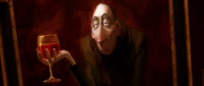
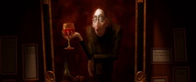
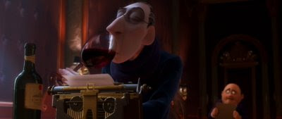
Did you see it? It's almost subliminal. Watch it again. The last, craning shot of Colette and Linguini kissing has the camera rotating counter-clockwise, which blends brilliantly with a shot inside Anton Ego's cold, stark office; the first shot of the next scene has just a taste of the exact same camera rotation, but rapidly decelerating to a level horizon (while continuing to travel backwards). We move from one scene (our dopey hero getting a big romantic kiss) to a completely different scene (the cold, dark, bitter office of Anton Ego) with a clever visual continuation of a camera move, not to mention the beautiful transition from one musical theme to another by composer Michael Giacchino.
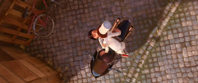
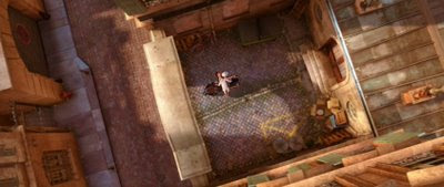
The counter-clockwise rotation of the camera that began in the courtyard sequence continues through the cut, settling on the portrait of Ego inside his office, leveling off and settling to a zero angle dutch mere moments after cutting into the scene.

This kind of physical choreography would have required a staggering amount of preplanning and careful execution, had "Ratatouille" been conceived as a live-action film. Not only would each camera move have required extensive previsualization (answering questions like, Can we fit a crane into that location? Do we have enough room to swing the camera that far in the interior location? How will we be able to match the rate of rotation on each end of the cut? etc.), but it also backs the live-action filmmaker into an editorial corner. This type of transition, which would require significant resources to pull off, locks the editor into this narrative decision: these two scenes 100% positively, absolutely need to live side by side, or else the production would have wasted valuable resources creating the shots to achieve this effect. And, when editing a film, especially a blockbuster-type Hollywood movie with lots of locations and lots of characters, one needs to have the editorial freedom to move entire sequences around.
But in the animated world, the continuation of a camera move from the last shot of a scene into the first shot of the next scene, is a relatively trivial matter. Even after the major editorial decisions have been made, and animation finalled, it is the simple, imminently doable task of creating new camera moves by the layout department to blend these two very disparate scenes together.

This example illustrates some of the fundamental shot design and editorial differences between live-action and animation. With the exception of expensive reshoots, the live-action filmmaker is required to pre-plan his long-term editorial choices, should his or her choices be anything more sophisticated than a cut, while the animation director retains a certain amount of freedom to make these kinds of decisions well into post-production.

Friday, June 27, 2008

Making John McCain Interesting

Sometimes, you need some heavy hitters from the world of visual effects to make John McCain interesting. From the June 25, 2008 episode of "The Colbert Report:"


That kid Johnny K. sure has a bright future ahead of him in visual effects.

For some reason, the actual "The Colbert Report" segment has gone mysteriously missing from the Comedy Central website as well as Hulu, so I've embedded John's clip from YouTube.

Tuesday, June 24, 2008

"The Polluting Sky" Restored

Well, I guess it was a matter of time. The other day, I received one of those fun emails from a very large online video service (let's say it rhymes with Shmoo Poob) indicating that one of my clips violates the copyright of a movie studio, and was pulled from the service. Never mind the fact that its usage is well within "Fair Use" specifications, and that the clip was being used for educational purposes, and it may have actually caused a viewer or two to rent or buy the movie in question.

Anywhoo, one of our most popular posts, "The Polluting Sky" is back online in its entirety.

As an aside, I recently had to apply this exact kind of foreground flaring to a shot I was working on just the other day. Funny.

Sunday, June 22, 2008

An Interview with Todd Vaziri, "Transformers"

Here's an interview that I did last year with Andrew Sibulsky, about my work on "Transformers." There were some really good questions, some of which Andrew culled from reader submissions on various cinema and computer graphics forums.

My favorite part of the interview was this question and answer:

Andrew Sibulsky: Over the last few years ILM has, by and large, produced work of an increasingly realistic manner, almost indistinguishable from live photography. Do you see the possibility of continued growth in the artistry and photorealism of shots, or are we reaching a plateau?

Todd Vaziri: I think the last couple years have been extraordinary for ILM for cranking out really photo-real work that is indistinguishable from live photography, that audiences don’t know what they are seeing – to a higher level than we’ve ever really seen before. I’m really talking about the last few years – "Pirates 2," "Pirates 3," "Mission: Impossible III," "Poseidon," and "Transformers." These films have a quality that goes beyond the 'wow' factor. If you show a normal moviegoer the finals reels of those films, I think that moviegoer would be really surprised at how extensive our work really is. I think people would be shocked at how many effects shots are completely invisible now. I mean, we had over 500 effects shots in "Mission Impossible III," and the average moviegoer probably thought there were a couple of dozen, or so. There’s a new level of photorealism going on here.

And it’s not just ILM – WETA, Sony, Rhythm + Hues, Digital Domain – we’re all hitting this nice stride of creating these amazing characters and assets that are truly believable, in the right context.

Do I see this slowing down or continuing to grow? I absolutely see it continuing to grow, because of the renewed emergence of shot design. Shot design is now the most important aspect of photo-real visual effects.

Let’s look at "Pirates 2," in particular Davy Jones. When you put the talent and the technology that has evolved over the years in computer graphics, there’s really no question that, even a few years ago, we could have achieved the photo-real quality of a Davy Jones. ILM and other companies have done it over the years. But what made Davy Jones so unique? What put it over the top? I firmly believe it was the shot design. Gore Verbinski and John Knoll and Hal Hickel, and most importantly, Bill Nighy – the actor who portrayed Davy Jones – created a methodology that was set up to shoot and animate his sequences, and it was just brilliant; it brought a level of spontaneity and magic to the scenes that would not have been there, had other methods been used.

You can tell, from "Pirates 2" and "Pirates 3" that everything was technically beautiful, but there was really something different, and it was this new way of thinking about shot design, how these shots are created. It wasn’t relying on old techniques, or being lazy and saying ‘We’ll figure it out in later’, after the sets have been struck and after we’ve left the locations. Shot design, from the very beginning of production, is absolutely important and you can see it also in "Transformers." How Michael Bay and Scott Farrar set up these shots in a very smart way, so that when it was time to animate and put our characters into the shots, it felt very normal and felt very natural. That’s what we were trying to accomplish with "Transformers."

The talent and there technology is there, it’s just a matter of how it’s used when it comes to shot design. If shots are planned in advance, or in a smart way, there’s really no limit to what we’re gonna be able to accomplish. And I’m not just talking about digital characters – humanoid creatures – it goes for anything: environments, fantasy worlds, whatever you can imagine, it has to do with shot design. Directors that are good at that are, like I said, Gore Verbinski, James Cameron, Steven Spielberg; they look at these visual effects shots not just as little parts of the film that amaze us, they look at it as part of the process. And when strong visual effects supervisors are there from the beginning, planning out and designing these shots, you’re gonna get some really amazing results.


Read the full interview with Todd Vaziri, Part 1 and Part 2.

Wednesday, June 18, 2008

Stan Winston

Stan Winston, 1946-2008

The impact of Stan Winston's legacy on modern visual effects filmmaking is immeasurable. He will be sorely missed, but his remarkable creations will continue to inspire audiences and future filmmakers for generations to come.

- Effects Master Stan Winston Dies, Variety
- Image from ilm.com

Comically Out of Touch, Part 2

Remember that clip of President Bush saying "he hadn't heard" that anyone was predicting $4 a gallon gas here in America, from the post 'Comically Out Of Touch'? Well, here's a little follow-up, courtesy of "The Daily Show" from June 10, 2008.


Tuesday, June 03, 2008

The Reimagined "Halloween," Part 4, Faces

The fourth of four posts looking at the cinematography and themes of Rob Zombie's "Halloween." Read Part 1, Part 2 and Part 3.

To close out our series on "Halloween," a look at some of the way Zombie and Parmet photographed various faces.