Friday, October 17, 2008

Out of the Fog

Just who are these people?

As you may have guessed from the relatively scant number of posts on FXRant over the past few months, I've been knee-deep in work. After seven hard months, I've finally completed a huge project for which I'm extremely proud. Unfortunately, we all have to wait eight long months to talk about it.

The good news is that I'm taking some time off before starting a new project, and in the meantime I'll be prepping some really cool articles to publish. So sit tight-- good stuff is coming soon. I received a lot of great, positive feedback from the "Dark Knight"/"Shining" articles, so look forward to more articles in that vein. We'll hand out some more Camera Shake Citations, and induct shots into the Depth Of Field Hall Of Shame (an upcoming feature), talk about how Movie Marketing is Hard, and much more.

And on a completely unrelated topic, here are two interesting articles about J.J. Abrams' upcoming film, "Star Trek," coming to theaters in May 2009.
"Star Trek:" New Movie, New Vision
Director J.J. Abrams has set a course to make the Enterprise cool again; here's the inside scoop on his surprising, idealistic odyssey, which may end up with Kirk and Co. driving next summer's box office juggernaut

Entertainment Weekly's "Star Trek" Photo Gallery

Tuesday, August 19, 2008

Movie Marketing is Hard! Nicolas Cage Movies

Another in our Movie Marketing Is Hard! series.Now that we know that The New York Times is keeping an eye on this blog, let's give them more of what they love: pointing out the obvious lack of creativity amongst studio ad campaigns.

Notice any, ahem, similarities between the one-sheets from these two Nicolas Cage movies? Gore Verbinski's "The Weather Man" (from 2005) and Andrew Niccol's "Lord of War" (also from 2005) have a few eerie likenesses.

  • Nicolas Cage, squarely facing the camera, looking straight forward
  • Cage wearing a coat and tie
  • against a white background, with a simple title graphic against white as well
  • most significantly, the exactly-the-same creepy, sad expression on Cage's face
Of course, the "Lord Of War" poster gets serious bonus creative points for the illustration of Cage's likeness using ammunition, while "The Weather Man" poster gets several points deducted for creating an image whose defining theme is that a big Hollywood star is in the film. And at one point, he gets nailed with a strawberry shake.

Fit to Print: Quoted in the New York Times

So, only yesterday I realized that we were quoted in The New York Times on a story about advertising trends and conspicuous and unintentional similarities among current marketing campaigns. Did I just write that? The New York Times? Someone from The New York Times, the newspaper of record, has read this silly website? And their head didn't explode from the egregiously poor grammar, unresolved arguments and questionable sentence structure prevalent throughout this site?

The article made mention of my most popular post, "Beowulf and 300," part of our Movie Marketing is Hard series, which probably rocketed to undeserved heights after being picked up by Defamer last year.

From November 20, 2007, in the freakin' New York Times, in an article titled "Imitation Hits the Marketing Business. Again.":

Sunday, August 17, 2008

Converging Lines: "The Shining," Part 2

This is Part 2 of our continuing series, "Converging Lines." Read Part 1.

As we discussed in Part 1, "The Dark Knight" combined careful choices of camera placement and lenses with production design and location work to create distinctive converging lines of perspective. Its ultimate aesthetic impact was to impart a sense of looming doom, about a city collapsing upon itself with individual morality and societal cooperation hanging precariously in the balance.

While the use of this visual tool was somewhat subtle in Christopher Nolan's film, Stanley Kubrick pulled out all the stops in "The Shining;" he and cinematographer John Alcott boldly made this stylistic technique a major, driving force in the aesthetic of their film.

For one, Kubrick and Alcott made the unusual choice of framing their film to the full expanse of the film negative, shooting with spherical lenses and ultimately projecting a 1.37 to 1 aspect ratio (As opposed to the standard 1.85 to 1 aspect ratio of standard Academy projection, or the 2.35 to 1 aspect ratio of widescreen films). In fact, Kubrick shot his final four films in this same way-- "Barry Lyndon" (also with Alcott), "Full Metal Jacket" (with Douglas Wilsome), "Eyes Wide Shut" (with Larry Smith). Shooting in this nearly square aspect ratio compresses the horizontal visual range. Vistas and wide, epic films are traditionally shot in widescreen, while more intimate, character-oriented films are traditionally shot in narrower ratios, like 1.85. Using 1.37 as an aspect ratio immediately gives "The Shining" a distinctive look.

Secondly, their use of this nearly square aspect ratio enhances the emotional and psychological effects of the use of wide angle lenses and long, parallel stretches in production design and location work. Kubrick rarely used a long lens, favoring superwide fields of view to exaggerate the feeling of claustrophobia and accentuate the converging lines of perspective.
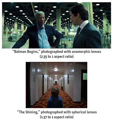
The same visual technique, photographed with different aspect ratios, gives the audience different psychological impacts. In "Batman's" horizontally wide field of view, the converging lines give the audience the impression that this large, expansive world is looking at its characters and challenging their moral fiber. In "The Shining's" boxy aspect ratio, the converging lines give the audience a creepy, uneasy feeling, as if the world is boxing us in, forcing claustrophobia upon the audience and the characters-- all of which are strong themes in the film.
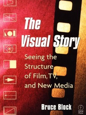
If you're truly interested in this type of discussion, I highly recommend picking up the amazing book, "The Visual Story" written by Bruce Block, which contains volumes about screen space, vectors, color, perspective, lenses and even the rhythms of a traditional Hollywood narrative screenplay. In one of the most interesting sections, "Story and Visual Structure," Block illustrates his ideas about story beats by analyzing and breaking apart the story beats of films like Hitchcock's "North By Northwest" and Spielberg's "Raiders of the Lost Ark." It's a must read for film fanatics who care about this kind of stuff.

Notice how Kubrick uses this technique in these frames from "The Shining," from the most apparent examples (any shot from the Overlook hotel hallways) to the less obvious (the police radio room and the near-point-of-view shot of Halloran).

Monday, July 28, 2008

Converging Lines: "The Dark Knight" Part 1

A strong, conspicuous visual motif of Christopher Nolan's "The Dark Knight" is the bold use of converging lines of perspective.

Nolan and his cinematographer Wally Pfister photographed "The Dark Knight" much like they did for its predecessor "Batman Begins," with anamorphic lenses. This time around, however, certain sequences were shot entirely with superwide lenses in the 65mm Imax format. Given that Nolan photographs and edits his films with a classic style (allowing the actors to move about the frame in wide and medium shots, and only going in for tight closeups when absolutely necessary), these wide angle shots give the film its distinctive feel, separating the movie from its louder, messier peers.

Like other films created by smart, visually-minded directors, "The Dark Knight" uses these powerful graphic tools to invoke a visual metaphor for themes within the film. These angles aren't used solely because it 'looks cool;' the style is inherently tied to the themes and ideas of the film. In Stanley Kubrick's "The Shining," for example, the converging lines of perspective gave the film a claustrophobic feel, as if the walls of the Overlook Hotel were literally collapsing onto the mind of Jack Torrance (Jack Nicholson). The production design (long, uninterrupted beams, corridors and hallways, etc.) and cinematographer John Alcott's choice of lenses and camera angles (short lenses, emphasizing scale and perspective) helped tell the story of a man slowly losing his mind.

"The Dark Knight" also utilized production design and cinematography to create these graphic images, and in many cases, (like "The Shining") strategically placing the point of convergence in the precise center of frame. Of course, the gorgeous streets of Chicago, particularly of La Salle Street in the financial district, helped a great deal. The interpretation of this visual style is certainly not iron-clad, and is ultimately up to the viewer to decide what it represents and how it emotionally affected them. I personally interpreted these images as a way of evoking the bizarre feeling of the pillars of society closing in on Gotham City; a looming anxiety and feeling of doom affects its heroes and villians and citizens alike, forcing them to make choices about life and death, good and evil, right and wrong.

The film is about the growing chaos and collapse of our morality, and is deeply interested in the choices we make as individuals and as member of society. Ultimately, we realize these choices start with citizens as solitary human beings (the choice to detonate the ferry bombs, the choice to assassinate Coleman Reese, the choice to help criminals to save one's family). The converging lines of the world are pointing at us. Gotham City is grandiose and complicated, but its destiny is determined by the choices of its inhabitants.

Here are a few frames from "The Dark Knight" that show off this stylistic device.


Coming in Part 2: shots of converging lines from "The Shining." Read Part 2 now.