 This is Part 2 of our continuing series, "Converging Lines." Read Part 1.
As we discussed in
Part 1, "The Dark Knight" combined careful choices of camera placement and lenses with production design and location work to create distinctive converging lines of perspective. Its ultimate aesthetic impact was to impart a sense of looming doom, about a city collapsing upon itself with individual morality and societal cooperation hanging precariously in the balance.

While the use of this visual tool was somewhat subtle in Christopher Nolan's film, Stanley Kubrick pulled out all the stops in
"The Shining;" he and cinematographer John Alcott boldly made this stylistic technique a major, driving force in the aesthetic of their film.
For one, Kubrick and Alcott made the unusual choice of framing their film to the full expanse of the film negative, shooting with spherical lenses and ultimately projecting a 1.37 to 1 aspect ratio (As opposed to the standard 1.85 to 1 aspect ratio of standard Academy projection, or the 2.35 to 1 aspect ratio of widescreen films). In fact, Kubrick shot his final four films in this same way-- "Barry Lyndon" (also with Alcott), "Full Metal Jacket" (with Douglas Wilsome), "Eyes Wide Shut" (with Larry Smith). Shooting in this nearly square aspect ratio compresses the horizontal visual range. Vistas and wide, epic films are traditionally shot in widescreen, while more intimate, character-oriented films are traditionally shot in narrower ratios, like 1.85. Using 1.37 as an aspect ratio immediately gives "The Shining" a distinctive look.
Secondly, their use of this nearly square aspect ratio enhances the emotional and psychological effects of the use of wide angle lenses and long, parallel stretches in production design and location work. Kubrick rarely used a long lens, favoring superwide fields of view to exaggerate the feeling of claustrophobia and accentuate the converging lines of perspective.
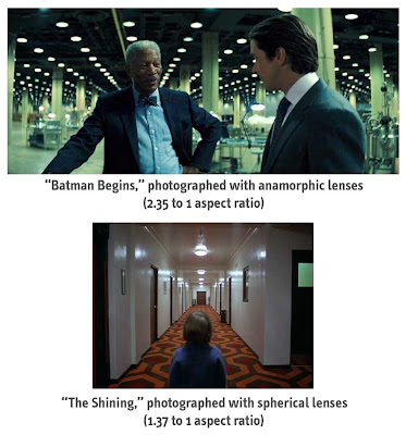
The same visual technique, photographed with different aspect ratios, gives the audience different psychological impacts. In "Batman's" horizontally wide field of view, the converging lines give the audience the impression that this large, expansive world is looking at its characters and challenging their moral fiber. In "The Shining's" boxy aspect ratio, the converging lines give the audience a creepy, uneasy feeling, as if the world is boxing us in, forcing claustrophobia upon the audience and the characters-- all of which are strong themes in the film.
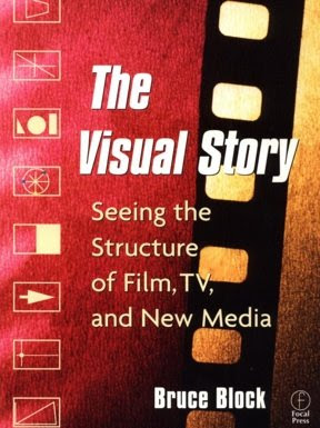
If you're truly interested in this type of discussion, I highly recommend picking up the amazing book,
"The Visual Story" written by Bruce Block, which contains volumes about screen space, vectors, color, perspective, lenses and even the rhythms of a traditional Hollywood narrative screenplay. In one of the most interesting sections, "Story and Visual Structure," Block illustrates his ideas about story beats by analyzing and breaking apart the story beats of films like Hitchcock's "North By Northwest" and Spielberg's "Raiders of the Lost Ark." It's a must read for film fanatics who care about this kind of stuff.
Notice how Kubrick uses this technique in these frames from "The Shining," from the most apparent examples (any shot from the Overlook hotel hallways) to the less obvious (the police radio room and the near-point-of-view shot of Halloran).


 Now that we know that The New York Times is keeping an eye on this blog, let's give them more of what they love: pointing out the obvious lack of creativity amongst studio ad campaigns.


