Wednesday, December 11, 2024

"Skeleton Crew", Neel and Misinformation

The cycle of downplaying or mischaracterizing digital effects is becoming distressingly predictable. I wrote about it at length, using the marketing of "Gran Turismo" — a film I didn't work on — as my example. 

When the misinformation comes for a project that I worked on (which has happened many times in the past), it becomes particularly infuriating.

In the lead-up to the release of "Star Wars: Skeleton Crew", Slashfilm wrote a piece on December 1st that loudly and proudly proclaimed that one alien character on the show was not created with digital effects. The headline "The Star Wars: Skeleton Crew Character Who Surprisingly Isn't CGI" isn't exactly leaving any wiggle room. The piece says "The elephant-like design of main character Neel (Robert Timothy Smith) may look a whole lot like a fully CGI creation, but that's actually quite far from the truth."

In reality, Neel was brought to life using a combination of techniques, including digital effects. Clayton Sandell documented this on Bluesky, based on interviews with "Skeleton Crew" ILM VFX supervisor Eddie Pasquarello and ILM animation supervisor Shawn Kelly.

From Clayton's reporting:

"Neel is a beautifully-creative mix of practical AND digital techniques: the voice & physical performance of young actor Robert Timothy Smith and a stunt performer; digital animation; and puppetry... Kelly says that in about HALF of all shots, however, the Neel puppet was either augmented digitally or replaced entirely, depending on the storytelling needs. In this shot from episode one, for example, Kelly says Neel’s head is 100% digital."


I was the compositor on this shot. (I was a lead artist on "Skeleton Crew" at ILM). Imagine my shock when I read the Slashfilm headline that invalidated the hard work our team put into a character, and saw a false mythology form right in front of our eyes.

On Bluesky, I politely asked Slashfilm to correct or amend their headline and article based on Clayton's reporting. And they did.

The new December 10 headline is "One Star Wars: Skeleton Crew Character Is A Stunning Blend Of Incredible Visual Effects" which is much better, and extremely accurate. A key sentence was added to the piece, as well:

"Neel was made using a stunning, seamless combination of practical and digital effects."

(Hilariously, the Slashfilm URL remains as it was originally published, which includes the string: 'star-wars-skeleton-crew-character-neel-not-cgi'.)

I humbly yet forcefully ask media outlets not to fall into the false mythology trap. Do not proclaim that a certain set piece, stunt, or effect from a movie was done "completely" with any one technique without having absolute certainty of the facts. Making movies is a team effort, and there isn't a "war" between the practical effects teams and the digital teams. We're all working together to make the best movie we can — we are in a symbiotic relationship, and anyone who tells you otherwise is trying to sell you a false mythology.


Friday, November 08, 2024

Todd Vaziri on The Incomparable, Talking About "Pitch Black"

I recently guested on The Incomparable to talk about one of my favorite science fiction movies, "Pitch Black" (2000).

Host Antony Johnston with Erika Ensign, Tony Sindelar, and Todd Vaziri. Vin Diesel, Radha Mitchell, Keith David, and a lack of bozos… It can only be 2000’s “Pitch Black,” one of the finer entries in the always-popular “Alien” homage movie genre. We enthuse about elevated filmmaking, great decisions, and low-budget effects.


Listen: https://www.theincomparable.com/theincomparable/741/


Friday, October 18, 2024

Center Framing is Not New

Seen on social media: "One thing that I did not like at all about The Substance was how it was filmed as if being cut into TikToks was its ultimate end goal. The action in every scene happens pretty much in the middle of the screen... It just looks so lifeless."

I was going to go off on the sad state of media literacy in today's culture, but I reconsidered and thought I'd rather do something fun instead. 

The original post implies that the filmmakers of "The Substance" (2024) chose to center-frame their film so that it would look good on TikTok. Which is absolutely bonkers. It also implies that there was very little artistic intent behind the framing choices of the movie.

see larger GIF

Just to illustrate the lunacy of implying that the central reason for center-framing a movie is TikTok, I decided to drop actual frames from "The Shining" (1980) -- a film with prominent center-framing -- into an iPhone 16 screen without doing any repositioning or scaling.

Who knew Stanley Kubrick made his film to look good on TikTok?! Amazing foresight from the master filmmaker!

Wednesday, October 16, 2024

This Shot from "Seven" is Not a Visual Effects Shot

A filmmaker friend reached out to me with a question about one of our shared favorite movies of all time, so I did what I sometimes do - I went totally overboard to find a satisfying answer and then wrote a long-winded article about it.

•  •  •  •

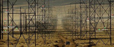
Near the end of David Fincher's 1995 masterpiece "Seven", John Doe takes Somerset and Mills to the middle of nowhere to reveal his final surprise. They drive to a desolate area surrounded by high tension power lines and towers. A combination of long lenses and wide lenses were used to alternate between images of long-lens compression of the space (the first image below), and scattered wider lenses to illustrate the desolation of the environment (the second image below).


Then comes this gorgeous shot, which happens to be one of my favorite single shots in the movie. A simple, slow tilt down of the car racing down the road, filmed with a long lens. It's breathtaking because it looks other-worldly, and some of that is due to the visual "compression" that happens to a scene filmed with a telephoto lens: objects that are far apart from each other "compress" in depth to look like they're actually existing very close together in real-world space. Filmmakers make lens choices to give a scene a deliberate, artistic feel. It's one of the many tools in a filmmaker's toolbox.


My go-to reference for the visual characteristics of long lens photography "compression" is a stunning shot from "Tinker Taylor Soldier Spy" (2011). Cinematographer Hoyte van Hoytema used an extremely long telephoto lens to capture this shot, which has narrative and character reasons for existing.

A shot from "Tinker Taylor Soldier Spy" (2011)
GIF in high-speed from Dramatic Filmmaking With A 2000mm Lens, by Vashi Nedomansky

As Vashi Nedomansky wrote, "This massive telephoto lens compresses the foreground and background so they appear to be very close together. The mile long runway allows the approaching plane to act as the agent of impending doom as a critical secret is revealed in the plot. The 2000mm lens keeps the actors and the plane at relatively the same size and adds incredible tension to the scene." The long lens alters reality, giving the viewer a different and somewhat warped perspective on the world, one that cannot be replicated with our naked eyes.

Another of my favorite long lens shots is the final shot from "Indiana Jones and the Last Crusade" (1989), which seems to place Indy, Henry, Sallah and Brody directly inside the setting sun. They gallop away from the camera, and yet they do not shrink in size, giving the shot an other-worldly feel.

"Indiana Jones and the Last Crusade"

This in-camera shot from "Lethal Weapon" (1987) illustrates the same effect. Shot with a telephoto lens, the characters are walking toward camera yet never seem to get larger in frame. They seem flattened against the Joshua trees in the background (hence, the term "compression").

"Lethal Weapon"

(It perhaps goes without saying that I studied each of these examples - and many more - when we were constructing this visual effects shot from "The Force Awakens" (2015), which had an equivalent lens of 2000mm, the same as the "Tinker Taylor Soldier Spy" shot.)

A visual effects shot from "The Force Awakens" that had an equivalent 2000mm lens
Compositing by Todd Vaziri

This visual compression of the world is put in more stark terms when one sees the same location shot with different lenses. For example, it seems preposterous to this Facebook user that the location of "Chotchkie's" in "Office Space" could be the same location in the photo below, taken from a smartphone camera (but it is, truly, the same location):


Lenses drastically change the way a location feels, which is why it's such an important storytelling tool. The same place photographed with two different lenses can seem completely different. This happens in real life with our naked eyes, as well. Notice how whenever you go to a baseball stadium in-person you immediately feel "it's smaller in real life than it looks on TV." This is also similar to the phenomenon of meeting movie stars in real life, and immediately remarking that "I thought they'd be much taller."

•  •  •  •


Back to our exquisite shot from "Seven". My filmmaker friend told me that he constantly hears from people on the internet that this shot is a visual effects shot, the idea being that director David Fincher wanted to see more towers than were actually at the location in Lancaster, so he used "CGI" to add dozens upon dozens of additional towers to make this shot dazzle. Also the heat ripple distortion doesn't appear in other shots, but he wanted it in this shot, so they used digital effects to add it. Was this a visual effects shot?

As an extreme fan of this movie and its filmmakers, as well as being a visual effects historian of sorts, I was flabbergasted. Never in all of my days had I ever heard of this shot being an optical or digital effects shot. In fact, as far as I know, there are zero visual effects shots in the movie (other than the opticals for titles, dissolves, etc.). To my eye, this always appeared to be an in-camera shot, without any optical or digital augmentations. But I can understand why some would folks would think that Fincher might resort to visual effects for this shot.

Argued Reason #1 - It's a visual effects shot because director David Fincher uses visual effects a lot!

Fincher, a former Industrial Light & Magic camera operator, has extensively used visual effects in nearly all of his feature films, starting with "Alien 3" (1992), then with groundbreaking visual effects work in "Fight Club" (1999), "Zodiac" (2007) and the winner of the Oscar for visual effects "The Curious Case of Benjamin Button" (2008). Since that time, Fincher has deeply integrated visual effects into nearly every shot of his subsequent films with intense collaboration between editorial and visual effects. For his films like "The Girl with the Dragon Tattoo", "Mank" and "The Killer", each of which have hundreds of visual effects shots, there are also countless shots which have been 2-D stabilized, transformed and warped, and reframed to an exacting degree to achieve a very specific aesthetic, further blurring the lines between editorial and visual effects. In short, Fincher uses visual effects as a key department in nearly every aspect of his films.

But "Seven" is the exception. Historically, the film sits at the edge of the optical-to-digital transition - only two years after "Jurassic Park" (1993) pushed digital imagery to new heights, and only the year after ILM produced invisible visual effects for "Forrest Gump" (1994). Augmenting a shot like the "Seven" long lens towers shot would not have been impossible in 1995, but it would have been extremely expensive, and a huge endeavor. As a reminder, the historical-peers for "Seven" are not necessarily movies like "Apollo 13", "Die Hard with a Vengeance" or "Goldeneye" (all of which had significant visual effects work), since all those had production budgets that were orders of magnitude larger than "Seven"'s. In fact, its budgetary contemporaries were movies like "While You Were Sleeping" and "Get Shorty".

And considering the fact that it's not, subjectively, a narratively important establishing shot, it's hard to imagine a scenario in which it was prudent to spend a massive amount of money on a shot like this. In addition, there's zero indication there are ANY visual effects shots of any kind in the film. There are zero visual effects credits in the end credits of "Seven", nor does any documentation exist that discusses any visual effects work.

Further confusion might come from the fact that the film has been tinkered with since its original theatrical release - but only in minor ways. The unique film process that was used for film release prints back in 1995 could not be used for home video. The bleach bypass technique which gave the movie its distinctive constrasty look simply could not be utilized as a source for VHS and DVD, so the look was replicated with traditional grading techniques. And for subsequent Blu-ray/HD/4K releases, the color grading was re-addressed using modern tools. In addition, certain shots and sequences have undergone grain and noise reduction, stabilization, reframes, and other slight tweaks, all of which were accomplished with modern digital tools.

Argued Reason #2 - It's a visual effects shot because the photos of the location look nothing like that shot!

As discussed earlier, lens choices can dramatically change the way a location feels. When I originally tweeted about this question, asking for first-hand evidence that the shot is visual effects, no one was able to send me any confirmation. Instead, most argued that photos of the location look nothing like the final shot, and therefore it's a visual effects shot.

Several folks sent me photos of the location in Lancaster, arguing that the photos of the location don't match the look of the shot from "Seven". Here's a behind-the-scenes photo of the scene being shot, that was featured in the American Cinematographer article on the movie that was also sent to me as "evidence":


"See? Hardly any towers! The real location looks nothing like that shot!" Well, these photos were shot with very different lenses than the movie shot, so this is not proof that the "Seven" shot is synthetic.

Kelly Port, Oscar-nominated visual effects supervisor, hopped onto Google Earth and may have found the exact road and angle of the shot, from the location in Lancaster, California. At first glance, it appears as though there "aren't enough towers!" But all it takes to get a better match to our shot is to zoom into the image a bit - simulating a long lens - and you get something that better matches "Seven":


Ultimately, no one was able to provide first-hand evidence that the shot was augmented by visual effects. The closest was a single blog post (to which I will not link) that presented these sentences: "The actual location where this scene takes place is on West Avenue I and 105th Street West in Lancaster, California. In the actual location of this space, there are only a few power lines scattered throughout the road. David Fincher added many more power lines with CGI." No citation was provided to support the last sentence. This is not evidence of anything.

So, I called in a favor, in order to settle this question once and for all.

I talked to a friend who has direct access to someone who knows a little something about the production of the film "Seven", directed by DAVID FINCHER, if they'd ask this person if that shot is a visual effects shot. And I got an answer: it's an in-camera shot. No visual effects were used to create this shot. The shot was filmed with a long lens on a platform. The heat shimmer is all real, captured in-camera.


The internet allows misinformation to thrive, and ultimately is an existential threat to truth. Even though misinformation about how movies are made is relatively innocuous when compared to almost anything else, it's up to folks who know what they're talking about to correct the information. And this blog post represents me taking my own medicine, when I said people should do something when they see misinformation online:

Write a blog post about how it's not true. Tweet how it's not true. Do a Myspace post. Type it out, make some photocopies and post them in your neighborhood. Flood the channel with truth!


update, 10/17/24: After I published this piece, I connected with that website and pointed out their incorrect statement. They were gracious and edited the piece, removing the offending sentence. 

update, 10/21/24: The Fincher Analyst/Leonard Zelig created a wonderful visual illustration of where the shot was filmed along with a graphical representation of the narrow field of view, counting up the landmarks in the shot. 


update, 10/22/24: I've been flooded with some additional, absolutely wonderful examples of long lens compression, and I'd like to share a few here.

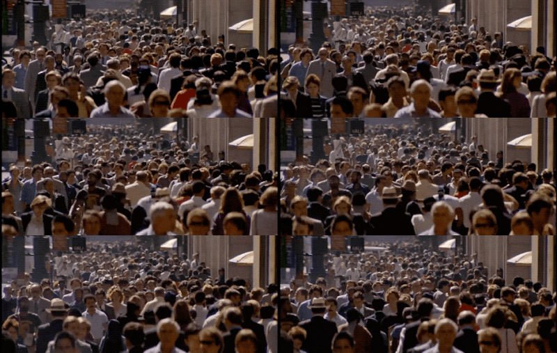
David Friedman over on Mastodon pointed out these two terrific examples. First, a classic long lens shot from "Crocodile Dundee" (1986) of a New York City street.

"Crocodile Dundee" (1986)

David also pointed out an additional long lens of a New York City street, this time from "Tootsie" (1982).

"Tootsie" (1982)

Here's a nice sibling to the "Tinker Taylor Soldier Spy" shot, a stunning shot from "Always" (1989), pointed out by Steve Smart on Threads.

"Always" (1989)


Friday, October 04, 2024

Lighter Darker: The ILM Podcast


I'm so happy to say that I'm the co-host of a podcast produced by Industrial Light & Magic. We call it "Lighter Darker."

Our name comes from the 1997 artwork made by ILM art director Benton Jew of a cover of a fictional comic book called "Attack of the Nitpickers", where scary, undead people (clients) hover behind a digital artist (who is handcuffed to his desk) and the poor artist is having to endure seemingly contradictory feedback from the horde, including "lighter... darker... split the difference..."


My co-host is Rob Bredow and we're produced by Jenny Ely, and we plan on doing twenty episodes of Lighter Darker this season. Some episodes will have guests co-hosts, and some will be just the three of us. We have been thinking about doing this show for years, and I'm so happy that it's finally come to fruition. My goal is to be the podcast that I wished existed when I was a young movie fan who was interested in how movies are made.

I hope you like it.

Find it at ilm.com and wherever you get your podcasts.

Welcome to Lighter Darker: The ILM Podcast, where we focus on the creative process of filmmaking and the art of visual storytelling. Hosted by ILM Chief Creative Officer Rob Bredow and ILM Compositing Supervisor Todd Vaziri, we share behind-the-scenes stories that illustrate the many crafts that come together to create a motion picture, TV series, or special venue project.

Whether you’re a seasoned professional, an aspiring filmmaker, or a fan of immersive experiences, Lighter Darker provides valuable insights, inspiration, and a deeper appreciation for the artists behind the projects we undertake at ILM in visual effects, animation, and immersive entertainment. We have a terrific lineup of special guest filmmakers who join the team for upcoming episodes to discuss the creative process of filmmaking and the art of visual storytelling.


Sunday, June 23, 2024

Hal Hickel on Creating Tarkin

Back in 2020, Hal Hickel answered a Quora question with great detail about how we created Grand Moff Tarkin for "Rogue One" (2016), and in the interest of film history preservation, I got Hal's permission to reprint it here. (I was a lead on the digital human team at ILM for Tarkin, and worked closely with Hal on the film.)

Hal summarizes our process succinctly, and corrects many misconceptions and untruths about how we made Tarkin, so I feel like this is an important document. To be frank, I hesitate to talk publicly too much about our Tarkin and Leia work for "Rogue One" because for some folks it generates a lot of... emotion.

I, like Hal, have no interest in defending the quality of our work. I'll say this: immediately after the movie came out, I talked to a lot of regular, non-industry people who saw the movie and asked them their thoughts on Tarkin, 'you know, the older gentleman who was Krennic's boss.' Many folks didn't understand the nature of my question, nor why I was asking it. They liked his performance, and didn't think anything further of it. Then I let them know that Tarkin is a digital creation, meant to resemble Peter Cushing who appeared in the original "Star Wars" (1977) and who died in 1994. I got a lot of stunned reactions from relaying that news. A lot of people who saw "Rogue One" had no idea that Tarkin was a digital, synthetic character, and just assumed it was a regular human actor.

I hope you like Hal's piece.

. . . . 


Quora: Why does Tarkin's CGI in Rogue One look so plastic-y? Could they have made it look more realistic?

Answered by Hal Hickel, Animation Supervisor for "Rogue One"

Hi, I was the animation supervisor on Rogue One, and as such I was intimately involved with the creation of Tarkin.

I’ve decided to chime in for one purpose only, to clarify the process we used. I have no interest in trying to convince anyone to like the results more than they do, or to argue with anyone about how “real” our work looked in the film. Again, I just want to clarify our process for informational purposes.

The broad plan was to hire an actor, film them on set in costume, and just replace the head with a CG Tarkin head, leaving the real body in the scene. The actor on set would be wearing a helmet with small cameras mounted to it, to record their facial performance (similar to what you’ve seen in the behind the scenes footage from Avatar, or Planet of the Apes).

That’s what we did, excepting that in about 30% of the shots, we opted for full replacement (head and body) with CG, because for certain shots it just made more sense.


Guy Henry was cast because he’s a terrific actor, and had the bearing and vocal quality we were looking for. It was helpful that he also had a certain physical resemblance (high cheekbones, etc), though that was not essential, given that the plan was to completely replace his head with our CG Tarkin. That said, when remapping the facial expressions of one person onto another (Henry to Cushing), the more similar they are, the easier it’s going to be.

The intention was never for Guy to do either a vocal, or physical “impression” of Peter Cushing, but rather to give us a performance that “felt” like Tarkin, both physically and vocally. So we never asked for, or expected a spot on vocal match, or for Guy to smirk, etc, like Cushing.

We didn’t do any modulation or any other audio tricks with Henry’s voice. We didn’t compare waveforms with Cushing audio, talk to his old manager, or any of that other stuff mentioned elsewhere in this thread. We just used Guy Henry’s voice. I’m sure Guy watched the Tarkin scenes from ANH endlessly, and did his best to find a tone and delivery that felt right.

Guy didn’t wear any prosthetics or makeup as part of the process, with the exception of the dots that help us track his facial movement. Someone in this thread talked about “makeup, cosmetics, physical altering”. No. Again, we just put dots on Guy’s face to track it’s movement, that’s all.

Guy was filmed on set, in the costume. The movement of the dots on his face, and his voice were recorded simultaneously during filming. I mention this, because some VFX companies prefer a method where Facial Capture is done separately, on a specialized stage at a later time. We prefer to capture an actor’s performance all at once (voice, body, face) whenever possible.

We also scanned Guy Henry on the ICT Light Stage, to give us a high resolution CG model of Guy Henry, and to capture his skin texture. Now why would we need a CG Guy Henry?
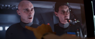
The CG version of Guy Henry (left) and the real Guy Henry as photographed (right), from Rogue One - A Star Wars Story: The Princess & The Governor Featurette


We needed it for a few reasons: One is that once we’ve tracked the motion of the dots on his face in a given piece of performance, rather than immediately applying that motion data to the CG Tarkin, we instead apply it first to the CG Guy Henry. This give us an apples to apples comparison to see if we’ve captured and processed the facial performance accurately. When we’re satisfied that we have, we then apply it to Tarkin.

Another reason, is that having the lighting data that is captured with Guy Henry on the Light Stage, gives us a sort of “ground truth” that we can compare our CG Tarkin to, to see if his skin is reacting to light realistically. Also, because there are many things about the fine details of Guy Henry’s skin that are appropriate for Tarkin’s skin (general tone, pores, etc), we can use the Guy Henry textures as a way to get a leg up on the Tarkin skin textures, rather than starting from zero.

Ok, so we’ve hired an actor, and shot them on location. We’ve built a CG copy of that actor in order to be able to check out facial capture data to see that it’s accurate, and to give us a “ground truth” for the skin texture and lighting.

Now we (obviously) have to build a CG Tarkin.

I noticed some comments in another answer in this thread about his mouth “not being aligned to his chin”, or the ears being “too long”. Again, I’m not here to argue the merits of our work, but I think it’s useful to point out that if you assembled hundreds of photographs of Peter Cushing (as we did), you would find that he can look vastly different from one photograph to another, depending on his expression, the lighting, the makeup, the focal length of the lens, the year the photo was taken, etc etc. So comparing a single frame of our Tarkin to a single photo of Cushing is not a particularly valid way to troubleshoot whatever issues there may be.

Luckily, we didn’t have to work from just photos. We had in our possession a life casting of Peter Cushing’s face. It was made not long after New Hope, so it was very accurate in terms of Cushing’s age, etc. Of course we know that sometimes the process of taking a life cast can slightly distort the face of the subject (the weight of the casting material can pull down on the skin), so we were mindful of that. That casting was a terrific starting point for us, and gave us very accurate information.

Starting from there, a very accurate CG model of Tarkin was created. As well, highly detailed textures, with pore detail, age spots, veins, etc etc. The CG hair groom was challenging, as the styling on Cushing for that role was a bit eccentric.

So taking one shot from the film as an example, let’s say a medium close up:

We track the movement of Guy’s head through space, so we can move the CG Tarkin head in the same way.

We track the dot motion on Guy’s face to extract his facial performance. We apply that motion to the CG Guy Henry, and if we’re happy with how it looks, we apply it to the CG Tarkin. By the way, someone in this thread theorized that perhaps the CG Tarkin was missing “micro expressions”. While we are always trying to increase the accuracy, and detail of our Facial Capture system, I have to say that even now, we are capturing very fine detail, including very tiny, barely perceptible micro movements. We are familiar with Paul Ekman’s work, and the importance of Micro Expressions, and have tried hard to be sure that level of fidelity exists in our work. If it was happening on Guy Henry’s face, it was happening on Tarkin’s face.

Now we have the real Guy Henry body, with the CG Tarkin head. We paint out any bits of Henry’s head that Tarkin doesn’t cover up.

We make adjustments to the facial performance to make it feel more “Tarkin”, since (unsurprisingly), Guy Henry doesn’t use his facial muscles the same way that Peter Cushing did. Guy doesn’t smile like Cushing, doesn’t form phonemes like Cushing, etc. So we have to do a sort of “motion likeness” pass. This is done by our animators, using a very light touch. Note: the point is NOT to change the acting choices made by Guy Henry, it’s just to adjust things so that when Guy chooses to smile, it looks like a Tarkin smile, not like a Guy Henry smile. Of course in doing so, we have to be very careful to maintain exactly what sort of smile it is. We don’t want to transform a mocking, insincere smile into a genuine, warm smile.

The Tarkin head with final facial performance is lit to match the lighting in the footage, and rendered.

The rendered CG Tarkin head is composited onto the real Guy Henry body.

There are of course many many steps to each one of the steps I’ve outlined above. Each one of these steps encompasses the highly skilled work of many many very talented artists and technicians.

So again, like it, don’t like it, that’s none of my business. I just wanted to get the facts out there, in terms of our process, because there was some inaccurate information being posted.

Thanks for reading.

H


Thursday, June 13, 2024

Lighting Techniques and Style

This is just a simple apples-to-apples comparison in the most basic sense of lighting techniques and style. No judgment, no "this is right and this is wrong", just a comparison.

The Hollywood cinematography of the interior of a cave, daytime, in a big sci-fi feature film in 1968. "Planet of the Apes" (1968), cinematography by four-time Oscar winner Leon Shamroy (18 total nominations!) who also shot "Cleopatra" and "The Robe".


The Hollywood cinematography of the interior of a cave, daytime, in a big sci-fi feature film in 2012. "Prometheus" (2012), cinematography by Dariusz Wolski, who also shot "Crimson Tide" and the original "Pirates of the Caribbean" trilogy.


Saturday, June 08, 2024

The Apple HomePod "Welcome Home" Ad was NOT 'All Practical'


In an effort to combat misinformation, I'm going to make short blog posts so maybe, just maybe it can make it into search engine results. Misinformation about how movies, TV shows and commercials is overwhelming, and I feel like I need to do what I can to try and slow it down.

A tweet highlighting the amazing work in the Apple HomePod ad said: "The fact that this Apple homepod ad is all real still blows my mind. The apartment stretching is not CGI, just practical effects, holy shit!"

This is not true.

The Spike Jonze-directed HomePod spot "Welcome Home" from 2018 is an amazing piece of art, due to stunning production design, physical effects, choreography, lighting and camera work BUT ALSO extensive digital visual effects and computer graphics.

Janelle Croshaw Ralla was the HomePod spot's visual effects supervisor. She also supervised visual effects for Jonze' "Kenzo World" spot with Margaret Qualley, and also was visual effects supervisor of "John Wick 4".

My original tweet: https://x.com/tvaziri/status/1799473454019928117


Sunday, June 02, 2024

Studios: Please Don't Spoil The Movie We Are Seated To See

I tweeted this incredibly non-controversial take and it got a huge reaction, so I thought I'd recycle the content for a blog post. Enjoy.


We took our kid to see "Alien" (1979) on the big screen during its one-week-only theatrical run. We told him there was a good chance of a pre-show featurette that would spoil the movie, so he needed to be ready to cover his eyes.

Well, that's exactly what happened.

My kid threw his hoodie over his eyes while a pre-show interview between Fede Alvarez and Ridley Scott appeared, featuring tons of behind-the-scenes photos of the alien, the chestburster scene, and discussion of the legacy of the classic film.

Why do this before the movie!??!

If even one person in that theater hadn't seen the film yet, it puts a huge damper on the surprise and delight that the movie would bring them, which is sad. We WANT to bring first-timers to theaters to see classic movies. Don't ruin it for them.

Play that shit AFTER the movie.

This has happened with several re-releases for me. Fathom did this to "Star Trek II: The Wrath of Khan" (pre-show highlighted a main character's death!) and "Close Encounters" (pre-show showed the effing aliens!). And now "Alien" (Disney/Fox).

The solution is simple: preserve the wonder for first-timers by putting these featurettes AFTER the movie. Tease it before the feature.

Anyway, "Close Encounters of the Third Kind" is coming to theaters again this summer (Fathom), so get ready to cover the eyes of first-timers before the show.

Original tweet thread.

Friday, April 05, 2024

Something We've Never Noticed in "The Abyss"

Selective attention is a concept that all filmmakers need to understand. When an audience is focusing on something, the aspects of the frame that are not directly related to the action, even if they're overwhelmingly dominant, can be rendered invisible to the viewer.

Take this scene from "The Abyss" (1989). In the middle of the most dramatic, most memorable, most heartbreaking scene in the movie, something happens.

Something happens that I didn't notice when I saw the movie in theaters in 1989. I never noticed it when I watched it over and over on my precious LaserDisc version of the film. I never noticed it when I watched it over and over on DVD. And I never noticed it when it finally debuted in 2023 on streaming. Watch this carefully, and then be amazed at what you didn't notice.


watch on YouTube


It's been like this since its release in 1989, and amazingly, has never been painted out of any subsequent releases - thank goodness. What's in the movie is in the movie. Studios and filmmakers need to exercise restraint during restorations, and resist the temptation to paint out "errors" visible in movies. For example, this bit from "Goodfellas" (which has been painted out of the most recent 4K release) and this bit from one of the "Terminator 2" Blu-ray releases, which had a ton of paint fixes and 'special edition' tweaks.

I'm working on investigating this further - I'd really like to know exactly what happened, and if anyone has knowledge about this extremely minute moment of filmmaking. Most likely, a diligent (and aggressive) camera assistant wiped the lens housing of water droplets during a filmed rehearsal, or during a take that they thought would be entirely unusable with water droplets on the glass. 

When the work is compelling, it's amazing what you can get away with.

Pointed out to me by Janne Ojaniemi over on Mastodon. Thanks, Janne!

Update 1: Bluesky user Neil Bulk told me that cinematographer Mikael Salomon pointed out the 'wiping of the lens housing during a take' in a Q&A screening, and was surprised to see Cameron use the take in the final edit.

Update 2: I've talked to two prominent "The Abyss" crewmembers, one of whom was in the editing room throughout the entire production. Both people said they never ever noticed this before, and this was 100% new to them.


Wednesday, March 06, 2024

Oscar Pool Ballot, 96th Academy Awards

It's time for the Awesomest Oscar Pool Ballot In The History Of Oscar Pool Ballots.

Every year I create a special ballot based on a typical Academy Awards printable ballot -- but on my ballot, each category has a different point value. The highest valued category is "Best Picture," while the mainstream films' categories are valued at two points. The non-mainstream categories (like the documentary and short film categories) are valued at one point.

This way, in a tight race for the winner of the pool, the winner most likely would not be determined by the non-mainstream films (in other words, blind guesses).

Download the ballot here for the 96th Academy Awards and use it at your Oscar party.


And if you're wondering why Tom Cruise is on my ballot... he's been on every one of my Oscar ballots. Because he's soooooooooo cool.